| Question Home |
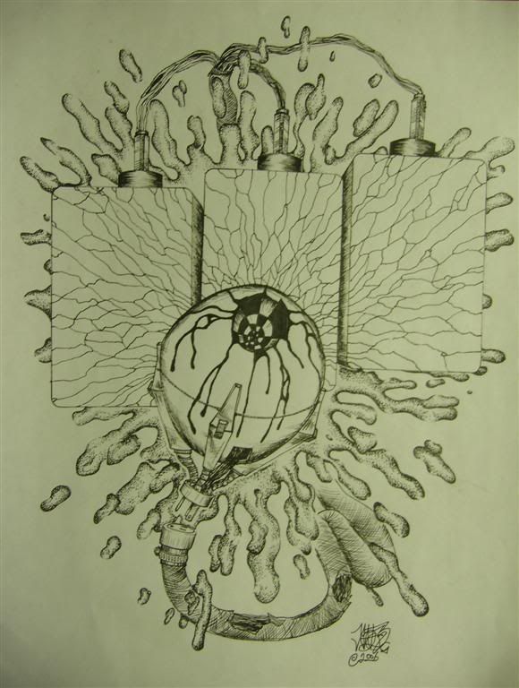
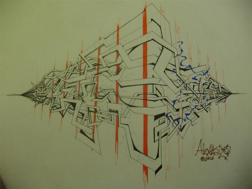
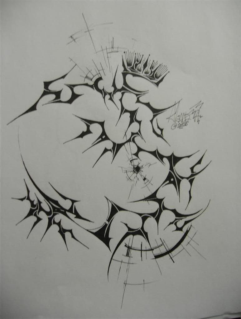
Position:Home>Arts & Humanities> Will you critique my art? (5 pieces)?Question: Will you critique my art? (5 pieces)?My name is Xander, I'm 17 years old and I've been experimenting with some new abstract and tribal designs. Each piece is approx. 17"x 22" Any critique would be great. The more you write, the better Best Answer - Chosen by Asker: On the 1st one, with the bit that I can only assume looks like an eye ball...did you want it to look slightly lop sided, or round. Great detail, but the shape threw me out of the illusion of realness. Free hand is great, but don't be afraid to employ tools like rulers and a compass. Other than that...it looks really nice. I especially like the cracked glass effect, I think you nailed it pretty well. The only comment on the second one I have is, where the center red vertical stripe is, it seems streaky where you laid down what I'm guessing is ink. I don't know if you like that, and if you do, great as that's valid...but I think I'd like to see it as continuous as possible with the color...maybe experiment with using acrylics. You might find you like the combination of media types, you might not. Just a suggestion. :) I haven't a thing to say about the 3rd one...other than, wow...nice job. You really did well with the composition and made my eye follow around the piece, and I really love the fact that you chose to not place the bullet hole in the center of the picture plane. Just fantastic. Nice dark blacks. Even color...just like I'd like to see that reddish orange stripe in the 2nd piece. :) The 4th one....bare with me, it's almost over. ;) I think this one is almost there, as it to me has an unfinished quality where as the hand is concerned. Where it connects to the funnel shape, seems a bit flat to me, and again I don't know if you want it to look like it is going back into the paper, but if I don't know this...then there's definitely something wrong with it. Because it's your job to illustrate your intent to the viewer. Don't make me guess. I suggest if this isn't your intent, then sort it out by giving the back of the hand some more shading, as well as shading the funnel to help round it out. Try darkening the background too, and/or darkening the outline. One or more of these in combination should hopefully do the trick. Anyway...I hope that's what you expected to get out of asking to be critiqued. I hope I was honest and helpful, and gave you what you needed to improve. Keep up the great work. :) |